
Our Colours
HiveFive's colours represents the bees. Our team want the palette to be connected with the bees, as that is our theme for this app. Yellow represents joy, which is what our team want the users to feel whenever they use our app. Alongside joy, yellow also represents optimism and hope. As the purpose of this app is to give notice and attention to the current situation of the bees in today's society, our team hopes that the users can feel optimistic that our bees will thrive in our planet once again.
001 Palette
#FFFFFF
White
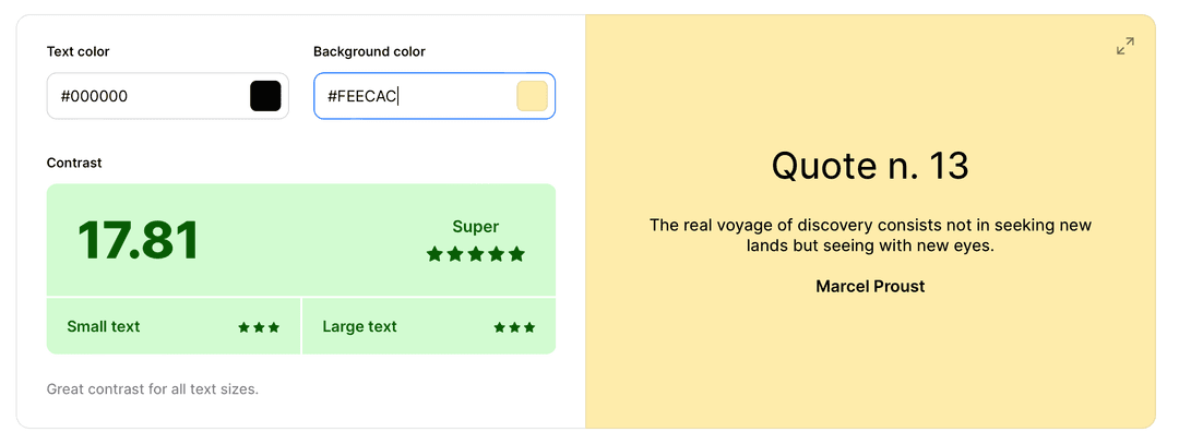
#FEECAC
Sunglow
#FFC93D
Vanilla
#000000
Black
#F48978
Salmon
#87AF1B
Apple Green
#79C9BC
Tiffany Blue
#FFE6E2
Misty Rose
#EAF6C8
Nyanza
#E0F4F1
Azure
002 Colour Accessibility
Our colour contrast is tested by both a figma plugin, and from the website Coolors.
These colours pass the contrast check for small and large text to a high degree at 17.81 which ensures that the text or icons are visible to everyone with different vision capabilities.
These colours pass the contrast check for small and large text to a high degree at 13.67 which ensures that the text or icons are visible to everyone with different vision capabilities.
These colours pass the contrast check for small and large text to almost the full degree at 10 which ensures that the text or icons are visible to everyone with different vision capabilities.
These colours pass the contrast check for small and large text to almost the full degree at 11.94 which ensures that the text or icons are visible to everyone with different vision capabilities.


003 Examples
Examples of how the colour palette is applied to our app.


